Potentia * Kitchen
Client
Potentia
My Role
· Brand Strategy · Branding · Social Media
Industry
E-Commerce
Date
2023
As an e-commerce venture, Potentia combines sustainability with style, offering a range of thoughtfully designed kitchen tools for the environmentally conscious consumer. Drawing inspiration from the brand's environmentally-conscious foundation, a visual identity that is both raw and refined.
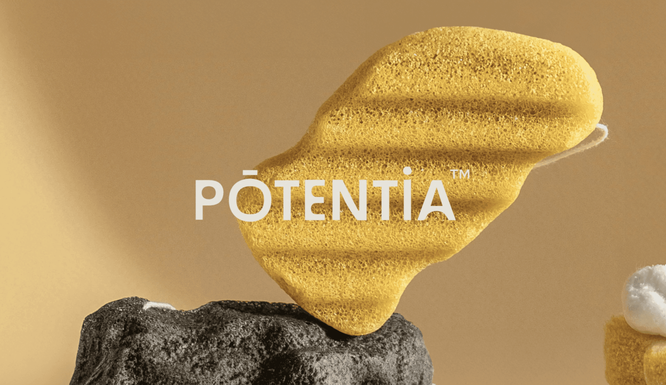
The logo, with its distinctive sans-serif typeface, carries a boldness, offset by an element of imperfection, highlighting the brand's focus on authenticity and individuality.To complement this, hand-drawn illustrations add an organic flair, bridging the gap between craftsmanship and eco-awareness, making each product feel personal and intentional.
The brand's visual language was anchored with a neutral palette—a nod to the earthy, eco-conscious essence at Potentia's core. To break the monotony and add a spark of life, a sunlit yellow hue was carefully integrated, encapsulating not just the heart of a lively kitchen but also symbolizing Potentia's optimistic vision of a sustainable future. The resulting brand identity for Potentia Kitchen seamlessly merges sustainability, style, and sophistication that resonates with eco-conscious consumers seeking quality, style, and purpose in their culinary choices.


